In Part I of PROTECTING YOUR NEST EGG, we posted two articles that made exactly opposing arguments in front of the same economic outlook. Hopefully, you were able to pick “The Cheshire Cat” between the two. As proven by that day’s WSJ, you will encounter the same type of opposing arguments on major economic topics, almost every day in the main periodicals. However, armed with simple tools such as Evidence-Based Decision Making, Looking Glass Perception and Market Rhythm, one should be prepared to “read between the lines” among contradicting financial stories to pick who is selling you a “tidy” picture. Likewise, over the next pages, we will re-interpret the last 100 years of financial history trends using these three analytical tools. You will be surprised to confirm that: consuming investment market information without the proper filtering gear can distort your long-term perception of market behavior and seriously harm your financial future. On a separate note, I’d like to thank REUTERS for supplying ample access to their long-term data bases, so we could graph & cross-check some of the information presented below.
SMOKE & MIRRORS
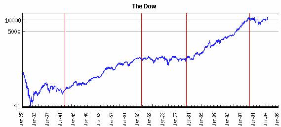
Below is the 100 year stock-chart that every stock broker worldwide has been taught to show you from the first day he attended the company’s investment seminar. This chart and the one showing the price behavior of the mutual fund he is trying to sell you today, always come together with the phrase “if you had invested $10,000.00 in such date, you would now have……..
I fact, if you visit http://investing.calsci.com/investing6.html, together with this chart, you will find this classic stock-broker observation: “As you can see above, over the last 70 years the Dow has done quite well. There was a rather striking “adjustment” starting in 1929, with the Dow bottoming out in 1932 and not fully regaining its previous high until 1955. However, as you can see neglecting minor “blips” the Dow has been on an upward trend pretty much non-stop since 1932.” In the words of Alice, this is a very “tidy” picture indeed. Beware, next thing we’ll see are big cat eyes, a smiling face and no cat!
Now, let’s take a look at the other side of the “Looking Glass” by comparing the same chart above with its real (adjusted for inflation) version. Notice that to obtain the real value of the stock market; we divided the Dow’s daily closing price into the closing price of gold and we drew a red line at each turning date. The reason, we used gold to get the “relevant evidence” from this chart is that Central Banks can’t print it and gold has had a specific value to human beings for about 5,000 years. When Central Banks print lots of their paper currencies, gold seems to be worth more, but when Central Banks stop their printing presses and hike interest rates, gold seems to be worth less. For instance, gold’s purchasing power increased by around 1000% during the 1970s and then fell by more than 80% between 1980 and 2001. In other words, although its price overshoots and undershoots its fair value by wide margins, it eventually returns to ‘fair value’. Over the very long-term, gold’s fair value is determined by the total quantity of US dollars versus the total quantity of gold in existence. The average commodity, on the other hand, does not behave in this way. One reason is that the price of every commodity except gold is strongly influenced by the current year’s production and in most cases, the real cost of production falls over long periods of time due to technological improvements. But in gold’s case, the existing stock aboveground is always so much larger than the yearly new mine supply (below 2%) that changes in the cost or the quantity of annual production have almost no effect on gold prices. Also, although gold is no longer used as money, it is still accumulated as if it was money and it still trades as if it were a currency. Further proof that dividing the nominal price of stocks into the nominal price of gold is the right way to understand their nature is to use the historic price/earnings Ratio Chart (the chart immediately below the Dow/Gold Ratio Chart). Just the fact that the Dow/Gold Ratio Chart is so strikingly similar to the P/E Ratio Chart, should tell you why the “currency” you must use to understand the pricing behavior of anything is gold.

After looking at the last two charts, you probably will never again waste your time looking at nominal charts or listen to people expressing their historical performance in nominal Dollars, nominal Euros, nominal Yen or nominal paper from any country. By the same token, forget about deriving inflation-adjusted values using any Central Bank’s measure of inflation (CPI, PPI, etc.), they are so distorted; they are deceitful. To know the historical value of anything over time, you must divide its price into the price of gold. You will not only get a true picture of purchasing power, but you will begin to understand Mark Twain, when he said “History doesn’t repeat, but it sure does rhyme. Maybe Twain understood Market Rhythm, but whether he did or not, you can see from the history written in these charts why the Risk/Reward Ratio is today very much against owning stocks and in favor of owning gold or some other real asset. Just from looking at the red line breaks in the last two charts, you can tell there have been two secular bull markets and two secular bear markets in stocks since 1929 and that we have just started a third secular bear market. Since gold is the chart’s pricing divisor, you will agree that simultaneously, gold has experienced the exact opposite trends to stocks after each red line. In other words, when stocks rallied, gold dropped and when stocks dropped, gold rallied. Also, over the last leg you can tell that gold and other commodities are starting to appreciate and they will probably move up and down in sequentially higher nominal terms as investors become more and more disillusioned with owing stocks and/or bonds and more convinced that gold is the way to go.
THE ROOT OF ALL “EVIL”
Another way to understand what’s going on with monetary assets (stocks, bonds and cash in whatever currency you hold them) is to take a look at the growth rate of the U.S. Money Supply (M3) over the past 100 years. Notice that after 1971, M3 exploded exponentially in the U.S. (and everywhere else) when the world’s leading economies decided to scrap the gold standard -a global monetary system under which the US$ was pegged to gold at $35/ounce and all other currencies were pegged to the US$ at specific fixed rates during the Bretton Woods Conference in 1944-.
The blue line on the chart above represents the U.S. money supply as measured by M-3, from 1913 (when the Federal Reserve was created) through to May 2006. (Please note that on March 2006, the Fed stopped reporting M-3, what you see after that is Statistical Liquidity). The pink line represents the market value of gold (priced in dollars) held by the U.S. Treasury. From looking at the chart, you realize that the gold held by the U.S. Treasury is not rising in value. What is in fact happening is that the dollar, which we use to measure the price of gold, is shrinking in value. Hence we need more dollars to price the same amount of gold and other items including houses, stocks, commodities, consumer items, mutual funds, etc.
In other words, the picture your broker has been trying to sell you as his fund’s “performance” is nothing more than the picture above, where $750 Billion in 1971 became $10.3 Trillion today, but the amount of “things” you can purchase stayed constant. He is not going to tell you that his fund increased 14 times in value because every “thing” denominated in dollars increased 14 times in value since 1971 (1.400%). In fact, most likely his fund increased much less than 14 times in values due to fees, trading expenses, taxes, etc. But whatever X times figure he comes up with will look very good to your eyes. The same principle applies to any nominal graph presented to you over any period of time after 1971. This is why the very first chart above, showing the Dow’s nominal growth for the past century is completely misleading, as you found out.
Similarly, in the future, investors holding monetary assets in dollars or other currencies will eventually lose most of their purchasing power. In fact, most investors are clueless about why gold prices, along with other commodity prices are rising so quickly of late. Most think it concerns the rise in oil prices or the turbulent geopolitical U.S. tensions developing with Iraq, Iran, Venezuela, Nigeria and other oil countries since September 11, 2001. But, instead, what we are seeing is the logical outcome from Triple Deficits (see “To Leave or Not to Leave Part II”): an acceleration of the destruction of the dollar and other major currencies brought about by Central Banks speeding up their printing.
“GOOD MYTH” HUNTING
With the above analysis, we have so far debunked all of the Investment myths listed in Part I of PROTECTING YOUR NEST EGG, but, just in case this is not clear to you yet, we will now spell out each demystification, one by one:
- “Avoid volatility, always put your money into the safest investment you can find”:
As demonstrated above, the worst you can do now is to hold an important portion of your money in cash or bonds. However, if what you want is to deplete your future purchasing power as quickly as possible and see your retirement turn into a nightmare, you might as well sign up for a TV Reality Show and get paid for your hardship!
Low volatility doesn’t “magically” preserve your purchasing power. In fact, it’s exactly the opposite. As you may have noticed in the Ratio Charts above, apart from necessary cash holdings, if you are going to hold long-term investments, you better make sure they are either stocks or real assets, because regardless of which one has the lowest Risk/Reward Ratio at any one time, fixed-income returns will do much worse than either of them:
- When the Risk/Reward Ratio favors stocks, by investing in them, your returns will be exponentially higher than in fixed-income assets
- When the Risk/Reward Ratio favors real assets, both your fixed-income returns and your fixed-income assets will be steadily destroyed by inflation
In short, unless you are holding them to secure short-term or medium-term solvency or you depend on them for income, fixed-income assets have the highest possible Risk/Reward Ratio in any environment. Holding them as a long-term investment should require safety labeling such as: “Hazardous to Your Financial Health” or better yet: “Only Benefits Governments, Banks and Highly Leveraged Corporations” notice you are not in the list!
- “Over the long-term, the stock market always goes up, just buy and hold”:
Right! “Up in Smoke” I might add. As you saw in the Ratio Charts above, the “special magic” to stocks and all kinds of mutual funds is that they are all expressed in nominal terms. And, as you know nominal terms only work when inflation trends toward zero. Otherwise, monetary assets only reflect monetary inflation, so when you look the chart labeled “$10.000 invested on such date…..” your are really looking at how the Fed increased the price of “things” from about 280 Billion dollars in 1971 to about 10.3 Trillion dollars today. Since we have just entered a new bear cycle in the real value of stocks, you will probably still obtain high nominal returns through them, but they won‘t buy you more “things” in year 2016.
- “Diversification is always good”:
Yeah! Particularly, if you don’t know what you are doing. As you may have concluded from the above analysis, there are really only two types of assets: Real and Nominal. When real assets are rising, nominal assets are dropping and vice versa. End of story. So if you really want to diversify, you can only do this by organizing your investments around:
- Your immediate and mediate liquidity needs and
- Your special knowledge
The first point requires that you keep enough short-term instruments in your portfolio to preserve a relaxed solvency, especially if you depend on interest returns for income and/or you are expecting big-item purchases. The second point requires that you invest most of your money in your own business (no one knows it better than you), the business of the company you work for (if you know what’s really going on), or your best friend’s business (if you really trust him). If none of the above applies, then put your money to work in whichever of the two sectors (real or nominal) offers you the lowest Risk/Reward Ratio.
Notice that apart from survival cash, the overwhelming theme here is “knowledge” and how it affects your Risk/Reward Ratio. Having better knowledge than others about any investment gives you the lowest possible Risk for the highest possible Reward. In the meantime, if you don’t really have a thorough understanding of what drives a business, stay out of it until you do. Diversifying among businesses you don’t really know much about is to hope that statistical error (by the rest of the market) saves the day for you. Aside from solvency risk, knowing the Risk/Reward Ratio of any investment should be your main criteria for safety. Put another way, the less you know about your current investments, the more purchasing power you will probably loose in the future.
- “Let your winners run”:
Run with your money, you mean! Ask the fellows that stayed put in April 2000 because their winners where really scorching! Unless you are professional trader, you don’t have the specialized knowledge and skills necessary to consistently profit from getting in and out of the investment markets. After several years of top-notch academic training in finance and 26 years of trading experience, I still take only those bets that are overwhelmingly in my favor, because the risk is practically zero or because of good knowledge of the particular situation. Yet, I wouldn’t try to “operate on myself” just because I am a good trader. So why would a doctor or a lawyer or anyone with special knowledge in his area, think they can “operate on themselves” when it comes to trading? Just ask any “Daytrader” from the late nineties (that came from a non-trading background) how much did it cost him to learn his “trade”.
- “The trend is your friend”:
You may have noticed that in the next-to-last paragraph in Part I of PROTECTING YOUR NEST EGG, I didn’t finished my story on the fellow that got out of the stock markets in 1998 and went into commodities, thereby missing the most extraordinary phase of the bull market and actually loosing some money until year 2000. Well, guess what happened since then? You guessed right, commodity markets (especially oil and gold), skyrocketed over the past 5 years and will probably keep on rising for another 5 to 10 years. There is just too many trillions of dollars running after a finite stock of real assets, whether they are oil reserves, gold reserves, silver reserves or any other “hard-to-print” type of asset. Thus, anyone currently looking for a long-term investment different from his special knowledge areas should be looking at entering the real assets sector* and then forgetting about his investment for the next 5 to 10 years, regardless of the trend. The reason why this should work is because at present the Risk/Reward Ratio in real assets is your “friend”. But keep in mind this also means that the Risk/Reward Ratio is the “enemy” of your stocks and particularly of your bonds (in any currency).
- “Currencies from Developed Economies are safer than other currencies”:
Have you ever considered why a piece of paper with the number 100 printed on it should be worth 100-times as much as a similar piece of paper with the number 1 printed on it? If you have, let me know, I always come back to the same thought! Seriously now, when you realize that the government can print as much money as it wants then you know that money must have no real value; this realization would lead to the question: why should I work so hard for something the government can produce in unlimited amounts at no cost to itself? It turns out, there is a cost and that is what makes those pieces of paper worthwhile: the fact is they can buy you “time” and since “time is money” you get adequately compensated for believing in (holding) those pieces of paper. In the end, you are willing to trade your work for paper, because holding that paper brings you immediate and real compensation in the form of interests that are higher or at least equal to expected inflation. In fact, the real short-term interest rate in any currency is one of the most important determinants of its exchange rate. This interest rate is, in turn, is determined by the nominal short-term interest rate controlled by Central Bank and by inflation expectations (the expected effects of inflation on the currency’s future purchasing power). In Venezuela, for instance, one of the main reasons why the parallel market FX rate has been stable for the past two years is the high short-term rate Central Bank pays Venezuelan banks (10% for 28-day CDs, while 6-year Bolivar bonds yield 8.35% fixed). Should Central Bank lower that rate significantly (as recommended by congress last Wednesday), Venezuelan banks would stand no chance of preserving their short-term deposits base and an immediate flight to quality (to other currencies) would begin that would probably spiral into a sudden increase of the parallel FX rate and eventually end in a banking crisis similar to 1994’s. It’s a good thing the MOF keeps those guys on a leash!
The same thing happens with the dollar and every other currency in the world. This is why last week’s commentaries by Bernanke about the possibility of rising short-term rates above 5% to avert inflationary trends, caused a quick reversal in the long-term dollar bear trend. However, once inflationary or devaluation expectations get set off, a currency will devalue no matter how high its Central Bank hikes interest rates. This is exactly what happens to Developed Country currencies when markets realize Central Banks are printing too many of them. The following chart shows how gold performed relative to the US$ for the past 35 years. Since high gold prices represent dollar devaluation, notice how it goes up significantly when confidence in the dollar falls and down when confidence in the dollar rises. However, since 1971, when the gold standard was dropped, developed nations currencies have been moving within a limited range with respect to each other because they are all subject to intense manipulation by their respective Central Banks (working in concert to devalue or revalue currencies whenever they move to the extremes of the range). Yet, when you see oil, gold, silver, metals and other prices steadily hiking up, you can bet that too many pieces of paper have already been issued.
As things stand today, the current monetary system provides governments an unlimited ability to inflate their currencies and rack up huge debts. The U.S. alone has printed over 10 trillion dollars and issued total liabilities of several times that amount. This pyramid scheme has also allowed banks to expand their balance sheets at mind-boggling growth rates. In contrast currencies from less-developed nations may be under tougher discipline; first, because they are forced to borrow in the currency of their creditors, so depreciating their country’s currency makes foreign debt unpayable (Argentina ring a bell?), and second, because their own citizens constantly curve their currency-printing appetites by converting local currency into “hard currency” (the currency of nations running a longer-term Ponzi scheme). Of course, none of this applies to Venezuela at the moment, starting with the fact that currency is not even freely convertible.

- . “Trading Commodities is another form of gambling”:
Even after five years enjoying a secular bull market, commodities are seen by the majority of the investing public as an investment threat or at minimum, a high-risk gamble. Gold and commodities in general were so badly discredited in their last bear cycle that during the last decade of the past century, they evoked a bad feeling among investors. Baby boomers, in particular, don’t want to hear about commodities, the story they really know something about is “stocks and bonds”. However, commodities are the quintessential anti-inflation weapon. They are real assets and as such, their pricing behavior has always counterbalanced monetary excesses. When inflation is increasing and confidence is down trending, gold will be in a bull market. Conversely, when investors regain confidence in monetary authorities and inflation trends down; gold will be in a bear market. This time around, however, western (and eastern) society may be facing an issue never seen before over the last century’s market cycles: the possibility that oil production may be peaking. Everyone knows how important oil is for our society and what rising oil prices could do to the world economy. So, is the spectacular gold bull market that started in 2001 due to Peak Oil? Or is it due to inflation?
- a. Peak Oil Revisited: The first chart below shows nominal oil prices for oil and gold. Notice how they both seem to be going up at different growth rates. However, as we have already learned, this graph doesn’t tell us much more than the story of U.S. monetary inflation going from $280 Billion to $10.3 Trillion, a meaningless story since we already know it. However, if we divide the price of gold into the price of oil, thereby deriving the gold/oil ratio, we obtain the second chart below, the one that should tell us what is really going on. As shown by the second chart, real oil prices are in fact close to their lowest level over the past 35 years. How come? Didn’t every newspaper say that oil prices were skyrocketing? Yes, but as pointed by the arrows on the Ratio Chart, the gold/oil ratio just tested a 20-year low in 2000, it did it again in 2005 and after last week’s gold price correction (oil didn’t budge) it might be heading there again. What does this say about Peak Oil? It says that it might be coming. Think of it, if in fact there was really an imminent oil shortage, oil insiders who knew about it would immediately take refuge by purchasing oil instead of gold or any other commodity. So, this Ratio Chart may in fact be measuring the “real” value of oil to our energy-based society with respect to gold, to any other commodity and especially with respect to any currency, no matter how strong.
- b. It’s Probably Just Inflation: On the other hand, over 80% of all goods currently manufactured in the world are indirectly oil-related and so is the cost of food production (pesticides, fertilizers, transport, etc.), so, it would be logical to expect nominally high oil prices to generate correspondingly high inflationary pressures, but since gold merely reflects monetary inflation, it wouldn’t pick up on oil-specific inflationary expectations. Please notice in the gold/oil Ratio Chart that over the past 35 years the only other time the gold/oil ratio was lower than in 2005 was during the second half of 1976. Immediately afterwards, inflation and gold initiated an almost parabolic rise against oil for three years, dropped for one and then went asymptotic until Paul Volker took over the Fed and started aggressively raising interest rates. However, this time around, “oil inflation” seems to be going faster than monetary inflation. If that were confirmed by a new gold/oil low (lower than 1976’s), it would be significant enough to think that we may be at the start of a new era, one where oil may definitely become scarcer. If no new lows are put in place by the markets, then this time too, inflation may be the ultimate instigator. This would be supported by the fact that commodity prices today are largely being driven higher by China’s explosive growth and in turn, China’s rapid growth is really being driven by inflation: inflation exported by the US via its current account deficit, inflation resulting from China’s currency peg to the dollar and inflation resulting from China’s own credit expansion.
Thus, either because Peak Oil forces investors to take refuge in oil or gold versus major currencies or because higher nominal oil prices initiate deeper inflation on the world monetary system, over the next 5-10 years, oil and probably gold should keep rallying in nominal terms until some unknown factor ultimately changes its secular bull trend.

CONCLUSION
All this time you thought you were protecting your future purchasing power by turning your Bolivars into Dollars CDs. But for the last ten, twenty or how many years you have kept your savings in Dollar CDs (or other “hard” currency CDs); the Fed took most of your purchasing power away from you. It’s very hard to accept being deceived. You may not even recognize what we are saying here and dismiss it altogether. But the pictures shown above are not an opinion, they tell a simple, incontrovertible story: in time, it took more units of any currency to buy the same amount of “things”. From the start, all you wanted was to store “value” not “things”. That’s why you traded out of Bolivars in the first place. But the Dollar story is exactly the same as the Bolivar story only that it gets “played out” over a longer time horizon.
Think of it this way: what has gone up 14 times since 1971 is not the value of “things” (oil, gold, silver, houses, cars, stocks, mutual funds, etc.), this stayed the same; what went up is the amount of Dollars necessary to purchase these items. But, since all “things” went up at the same time, you couldn’t notice the devaluation. Thus regarding your present and future savings, the dilemma you have now is to decide whether to forget about all this stuff and keep on “saving” the way you have always done it or, to stop and do some research to confirm the findings on this report. What you do next is what counts.
PROTECTING YOUR NEST EGG (Part III)
Now that we are relatively clear on how investment markets worked in the past and where they seem to be heading, we need to define and execute a strategy to protect the nest egg. Since I have already taken a lot more space and time than initially budgeted, I must leave strategic and tactical details to my next delivery. Please try to refresh your memory regarding Monte Carlo Simulation or look it up in Google or Wilkipedia. We will be using that concept and other analytical tools in order to draw the outline of what your individual strategy should look like in the years to come. Additionally, we will show the investment instruments that exist today that allow you to execute your strategy at the lowest possible cost. With our guidance, you should be able to manage your money under the Risk/Reward Ratio principle for safety and then, turn away from watching every twist and turn the markets make as they unfold towards their ultimate intrinsic values. Only one caveat: Don’t try this on your own or to use familiar terms: Don’t try to operate on yourself, even if you are a doctor. Get at least, a second opinion!
*Those of you who have been waiting for a good opportunity to build up exposure to the gold sector may do some buying now. However, it doesn’t make sense to jump in with both feet at this time because although last week’s low may have been the ultimate price low for the current correction or within a few percent of its ultimate price low, the overall correction is likely to last until at least November of this year and might even extend into the first half of 2007.
Leave a Reply