“Take your protein pills and put your helmet on”. David Bowie
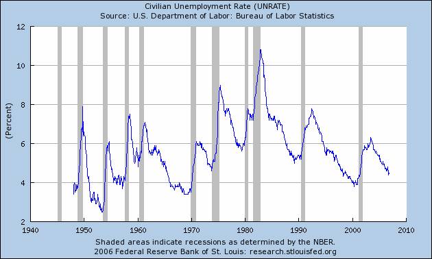
Two weeks ago we pointed out that come next quarter; even if GDP starts crumbling, Bernanke will have to stay firm. The main reason being that at the first sign of easing, the US economy’s current pro-inflationary structure would entice a nasty dollar sell-off and possibly an inflationary spiral. On the other hand, once a recession begins, deflation expectations will break the back of asset prices and enable the Fed to ease. However, as always, we can’t have our cake and eat it too: by staying firm ahead of recessionary expectations, the Fed will cause a hard landing. This means that once recession starts, no matter what the Fed does, the unemployment rate will rise almost vertically (see chart below) as it always does.
In this context, it is easy to understand why tomorrow’s FOMC policy statement (at 14:15) and last Friday’s job figures are so meaningful to the markets. As charted below, for the past 60 years, every recession started with a brutal rise in unemployment. Thus, we are all on the watch for even minor rises of the UNRATE and what the Fed has to say about it. For instance, if next month, Friday’s 0.01% increase gets followed by a higher number, the markets may interpret October’s 4.4% unemployment rate as the top of the economic cycle. If such were the case, expect the stock and commodity markets to begin crashing. By then, the next question that bears revisiting will be: how long to the bottom? Here is one answer:
As seen in our St, Louis Fed chart last week, housing starts fell, on average, 50% from peak-to-trough in the past seven US recessions. Given they have dropped 34% since this January, just to match the average, they must plunge another 20% over the next several months. On the other hand, with respect to housing prices you must consider Yale Professor Robert Shiller’s index which tracks Existing House prices, adjusted for inflation, since 1890: After seeing the chart from his book “Irrational Exuberance” (below), you won’t have any more doubts about the US housing bubble and what comes afterwards. Now, to answer the question about the bottom, we need to compare Shiller’s chart to that of another famous real estate bubble, Japan:
The 83% price rise you see from 1997 to 2005 in Shiller’s chart is similar in size and length to that of Japan’s real estate price froth of 1980 to 1991 (next chart). Two notable differences between these charts: 1. Regression to the mean in US house prices is starting 2 years early with respect to Japan’s. 2. Those 2 extra years took Japanese real estate prices up 110% from 1980, 32% higher than in the US bubble. Let’s hope that makes a difference, otherwise we may be signing up for a 13 year trip down the tube. That would be three times longer than the IMF’s four year average shown in one of our earlier bulletins (“A THREE DOG NIGHT”).


Leave a Reply